Destination Discovery - Thomas Cook
Overview
Thomas Cook was migrating its website to a Material Design based framework to modernise the
interface and improve the mobile experience as mobile traffic continued to grow. While the primary
goal of the migration was visual, it created an opportunity to address several long standing usability issues in the holiday search journey. Search was a critical conversion point for the product, as most bookings began with travellers exploring destinations and packages through this flow. I used the migration as an opportunity to improve how users begin a search, refine filtering interactions and compare holiday packages more easily.
The Challenge
Users could technically search without selecting a destination, but doing so returned thousands of
holiday packages. With more than 3000 results available, the list became overwhelming and difficult to explore. During usability testing I observed that some users would select a random destination simply to narrow the results enough to begin browsing. Filtering was also slow and frustrating. Each filter selection triggered a full page reload while results were generated server-side. Applying several filters required repeating this process multiple times, often leading users to abandon the search.
Understanding How Travellers Search
User interviews and usability testing revealed that many travellers begin planning a holiday without
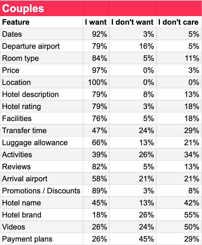
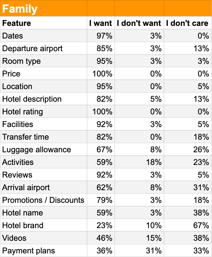
a specific destination in mind. Instead, they often start with a general idea of the type of experience they want such as a relaxing beach holiday or a lively destination. A card sorting study with 80 participants helped identify which pieces of information were most important when comparing packages. Details such as departure airport, travel dates, board type and room type consistently ranked highest.
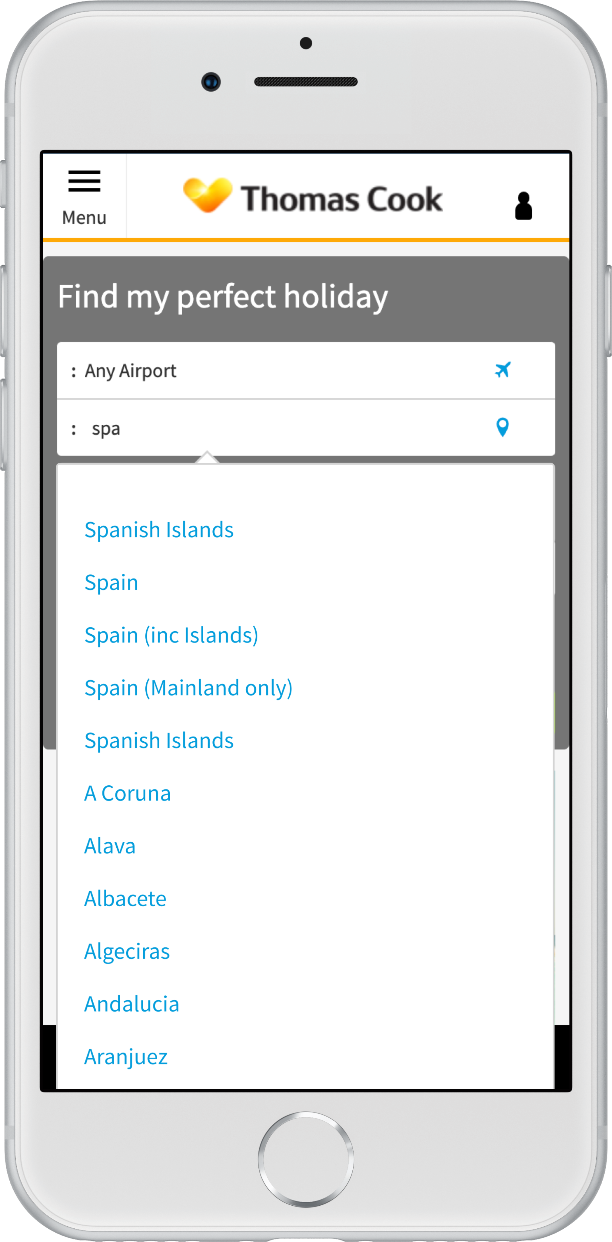
Helping Travellers Start a Search
To address overwhelming results, I introduced curated destination suggestions within the search
interface. Instead of forcing users to begin with a specific location, the interface surfaced
inspiration led options such as destinations popular with couples or all inclusive favourites.
Selecting one of these options automatically applied relevant filters to the results page.
Before
(Single select)
After


Designing Around Slow Filtering
Filtering holiday packages was one of the most frustrating parts of the experience. Each filter
selection triggered a full reload of results due to backend limitations. During testing I observed
participants selecting multiple options within the same filter group, such as hotel facilities. Because
the interface applied filters immediately after each selection, users were forced to wait repeatedly
for results to reload. To address this, I redesigned the filtering interaction to support batch selection within filter groups. Users could select multiple options before the filtering request was executed. Although the backend behaviour remained unchanged, this significantly reduced perceived waiting time.
Before
After
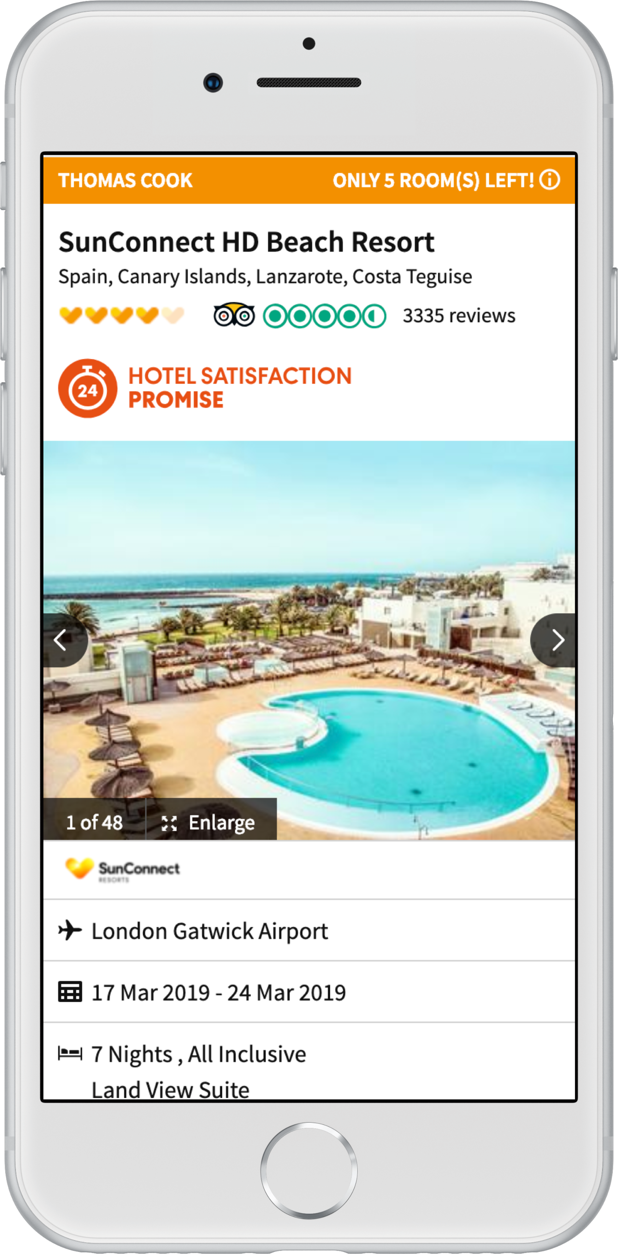
Simplifying Search Result Cards
Over time the search result cards had become cluttered with branding, promotional messaging and
package details, making it difficult for users to scan and compare options quickly. To improve readability I reorganised the layout and introduced two tabs. The default tab titled “What’s included” surfaced the key details users needed to compare packages.
Before
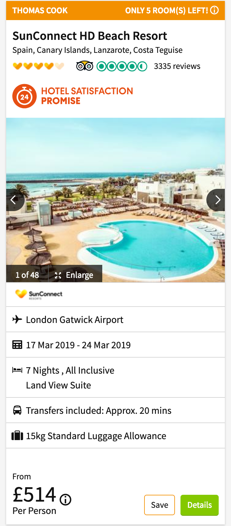
After
Outcome
The redesigned experience was tested through mobile A/B experiments against the existing
interface. Signals suggested the experience improved: • Reduced drop off during the search journey • Users spent longer evaluating options on the results page • Click through to hotel pages decreased slightly, which aligned with the design goal of surfacing more information directly in the results list.